
Brand Toolkit | Color, Typography + Graphics
Project Summary
Developed a scalable brand system to unify Nations Roof’s visual identity across 50+ offices nationwide, expanding its toolkit with refined colors, typography, and graphic elements to ensure consistency across marketing and sales materials.
My Role
Creative Director, Designer — created a cohesive, scalable brand framework in collaboration with the Nations Roof marketing team, focusing on color system expansion, typographic hierarchy, and design elements that bring structure and flexibility to the brand.
Deliverables
Brand Toolkit · Color System · Typography System · Design Elements · Reference Guide
Background
Nations Roof is a national commercial roofing company with more than 50 regional offices, each producing its own marketing and sales materials. While the core brand was recognizable, the lack of a unified design system led to visual inconsistencies and inefficiencies across collateral. The marketing team needed a toolkit that could bring clarity, scalability, and structure to the brand.
Challenge
The goal was to create a comprehensive yet approachable system that regional teams could easily adopt — one that expanded the existing color palette, defined consistent typography rules, and introduced versatile design elements that aligned with the company’s established brand voice and values.
Objectives
Expand the brand’s core palette to include gradients, accent colors, and neutral tones.
Establish a clear typography hierarchy for print and digital applications.
Create flexible graphic elements that reinforce Nations Roof’s identity and visual cohesion.
Package the system into a concise, easy-to-use reference guide for marketing and sales teams.
Solution
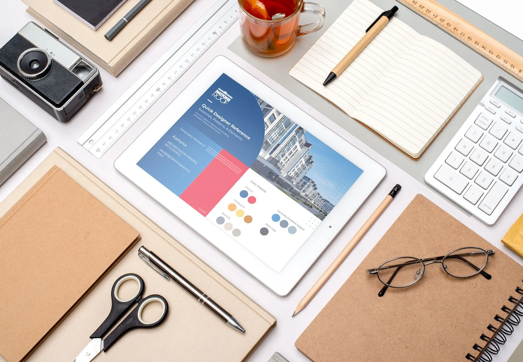
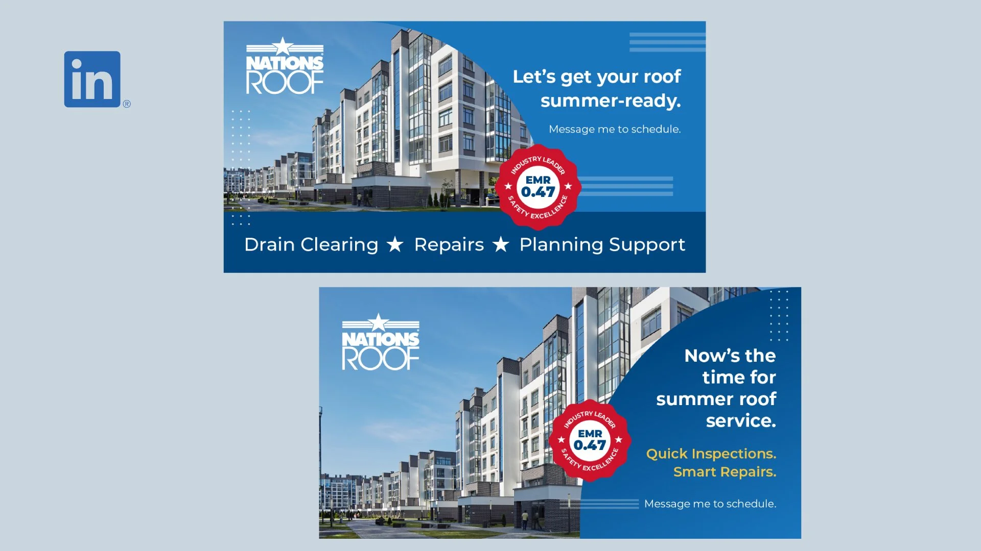
I built an integrated brand toolkit that unified Nations Roof’s visual language. The updated color system introduced complementary neutrals, gradient options, and vibrant CTAs that enhance hierarchy and depth. The typography system established clear pairing rules and weights to improve readability and brand expression. Custom graphics — including dot grids, stripe patterns, and rounded containers — were added to introduce flexibility while maintaining cohesion.
The final toolkit was delivered as a quick-reference guide, providing regional teams with ready-to-use assets and brand direction that scales effortlessly across print, digital, and environmental applications.


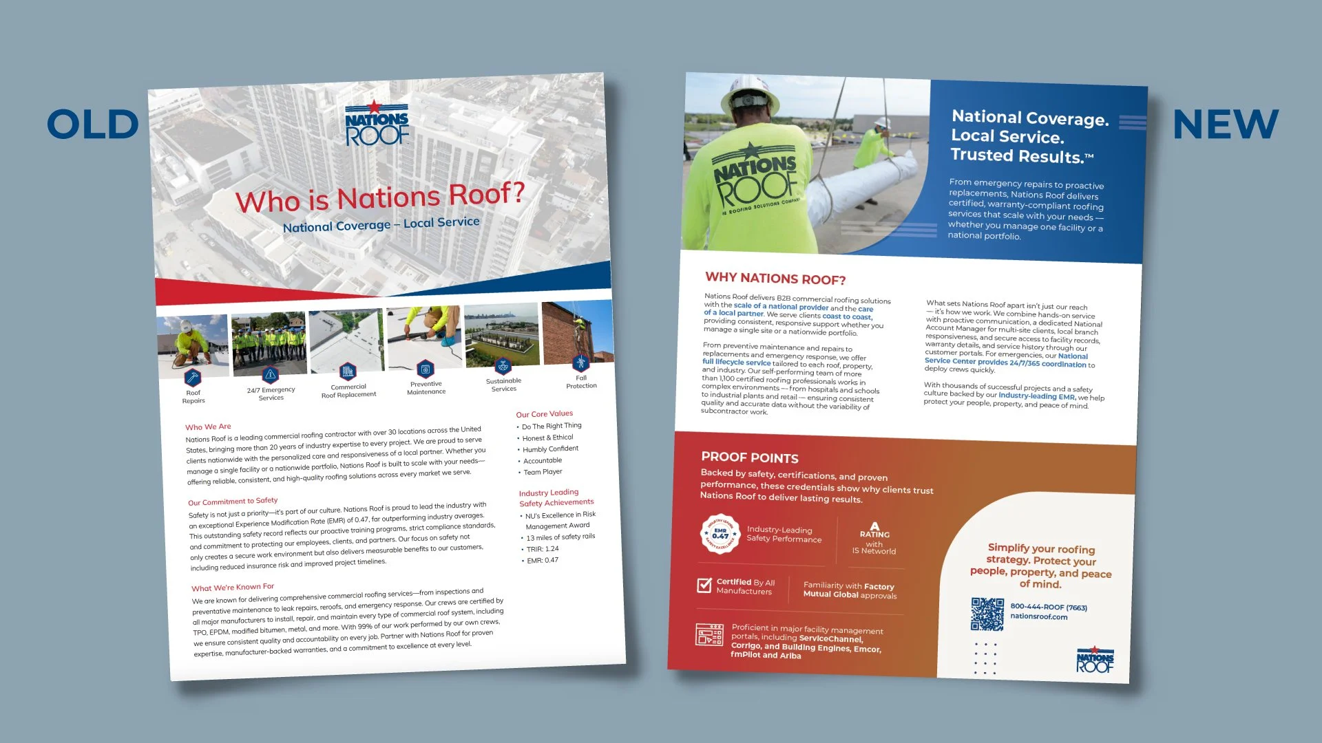
Impact
The new brand toolkit strengthened Nations Roof’s visual consistency across regional and national touchpoints. Marketing and sales teams now share a unified visual language that improves efficiency and brand recognition. The system’s flexibility allows new collateral to be created faster and with greater confidence, supporting the company’s ongoing growth and national brand alignment.